
Before reading our comprehensive guide on radial balance in graphic design, you can review my article titled Balance in Graphic Design, where I explain the types of balance.
When creating a composition in graphic design, our biggest goal is to manage the viewer’s eye. Determining where the eye will look on the page or screen is the key to a successful design. This is exactly where “Radial Balance in Graphic Design” comes into play. This technique is a powerful hierarchy system where visual elements spread out in a circular arrangement around a central focal point. Radial balance is not just an aesthetic choice. It is also a strategic tool to convey the message to the viewer in the fastest and most direct way.
What is Radial Balance? (Technical and Theoretical View)
Radial balance is a type of balance where visual weight radiates outward from a center (centrifugal) or gathers inward from the outside (centripetal). We see this form frequently in nature. The petals of a flower, the spirals of a sea shell, or the iris of the human eye are examples of this.
In design, this is built upon a circular grid system. The point in the center is fixed. All other typography, visuals, or shapes are positioned according to the gravitational pull of this point. This structure gives the design both depth and movement.
“Radial balance is like an invisible anchor that organizes the chaos in the design; it keeps everything together and in balance.”
Psychological Effects and Importance of Radial Balance
The human brain finds processing circular forms easier than angular forms. This explains why radial balance is so effective.
- Facilitates Focusing: Our eyes naturally gravitate toward the center of an image. Radial balance utilizes this instinct. Thus, the viewer perceives the main message without asking “Where should I look?”.
- Sense of Integrity and Trust: Circles are shapes with no beginning and no end. Therefore, they give a sense of infinity, unity, and completeness. Brands prefer circular logos for this reason to convey a message of reliability.
- Dynamism and Energy: Lines radiating outward from the center create a sensation of explosion or spinning even in a static visual. This adds energy to the design.
Types of Radial Balance in Graphic Design
Radial balance is not uniform. You can use three different variations depending on the needs of your project.
1. Symmetrical Radial Balance (Full Reflection)
In this type, elements are ordered at equal distances from the center and are identical or similar to each other. Think of a kaleidoscope image or a clock face.
- Usage Area: Frequently used in corporate identity works requiring formality, seriousness, and order.
- Effect: Provides maximum order and calmness.
2. Asymmetrical Radial Balance (Dynamic Balance)
The center is distinct, but the elements around it may be of different sizes, colors, or shapes. Visual weight is maintained, but there is no exact symmetry.
- Usage Area: Ideal for more modern, creative, and energetic poster designs or web interfaces.
- Effect: Surprises the viewer and ensures they look at the design for a longer time.
3. Spiral Denge (Altın Oran)
Merkezden başlayıp genişleyerek dönen bir yapıdır. Fibonacci dizisi veya Altın Oran spiralleri bu gruba girer.
- Kullanım Alanı: Sanatsal illüstrasyonlar, fotoğrafçılık ve sofistike mizanpajlarda tercih edilir.
- Etkisi: Gözü yumuşak bir şekilde merkeze taşır, hipnotik bir etkisi vardır.
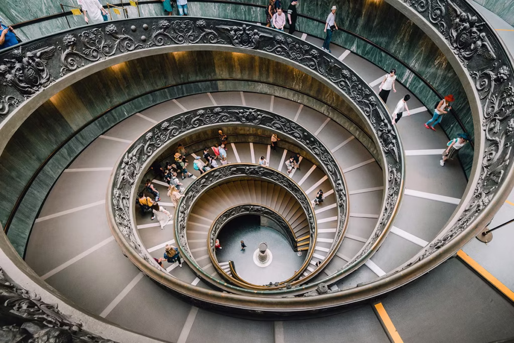
3. Spiral Balance (Golden Ratio)
It is a structure that starts from the center and rotates while expanding. The Fibonacci sequence or Golden Ratio spirals fall into this group.
- Usage Area: Preferred in artistic illustrations, photography, and sophisticated layouts.
- Effect: Carries the eye softly to the center, has a hypnotic effect.
Sectoral Usage Areas and Examples
Let’s look at usages in different disciplines to turn radial balance from theory into practice.
Logo and Brand Design
Many global brands use radial balance. For example, the BP (British Petroleum) logo is in the form of a sun or flower radiating from the center. This supports the claim of being energetic and eco-friendly. Similarly, the Starbucks logo places the mermaid in the center, drawing all attention to the face of the brand.
Web Design and UI (User Interface)
Radial balance is effective in entry areas called “Hero Sections” on websites. The main product or message is placed in the middle. Menu items or visuals are distributed around it. Also, loading icons (loading spinners) are the simplest and most functional example of radial balance.
Poster and Print Design
In movie posters or event posters, the main character or event is in the center. Supporting characters or details surround the center like a halo. This method summarizes a complex story in a single glance.
How Do You Apply Radial Balance in Your Design?
You can follow these steps for a successful radial composition:
- Choose a Strong Center: What will be the “star” of your design? This could be a product photo, a headline, or a logo. Place this in the center.
- Create Layers: Imagine rings moving outward from the center. Place information on these rings according to the order of importance.
- Use White Space (Negative Space): Do not cram elements too tightly into the center. Leave breathing room between elements to strengthen the sense of balance.
- Provide Direction: Guide the eye from the outside inward (to the center) using lines or arrows.
Advantages and Disadvantages Table
Like every technique, radial balance needs to be used in the right place.
| Advantages | Disadvantages |
| Clear Hierarchy: The most important element is indisputably clear. | Loss of Space: Corners may remain empty on rectangular screens. |
| Rapid Perception: The message is understood within seconds. | Risk of Monotony: The design may become boring with constant use. |
| Aesthetic Appeal: It is pleasing to the eye as it is close to natural forms. | Application Difficulty: It is difficult to place text in designs containing too much text (e.g., magazines). |
Conclusion
Radial balance in graphic design is one of the most elegant ways to manage the viewer’s attention. Whether you are designing a logo or creating a complex data visualization; defining the center correctly is half the work. You can take your designs to the next level by using the reassuring structure of symmetry or the energy of asymmetry. Remember, a good design doesn’t just look beautiful; it guides the viewer’s eye. Radial balance is the strongest compass of this guidance.