In the evolution of digital design, the “list view” was a safe haven. However, as data density increased, lists began to fall short. Users no longer want to read information; they want to scan it. This is where the Bento Grid, perfected in Apple’s ecosystem and dominating web trends, steps in. Because this system is not just an aesthetic choice; it is the most mathematical way to manage cognitive load. In this guide, we will examine in depth how to build the Bento Grid system from scratch, which UX laws it is based on, and the technical implementation details.
“Good design simplifies complex problems so much that the user thinks the solution was always there.” — Jakob Nielsen
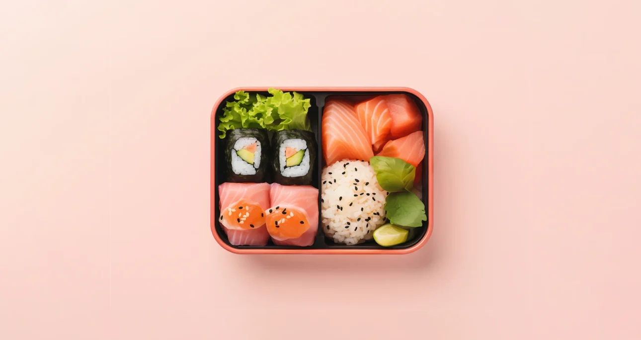
1. Anatomy and Mathematical Basis of the Bento Grid
Conceptual Framework: Bento Grid is fundamentally based on the CSS Grid or Masonry Layout logic. However, its difference from Masonry is that it maintains a strict rectangular boundary. In this way, it does not overflow outside a defined main container. Each cell constitutes a part of the total area.
Grid Mathematics: A successful Bento design is not done randomly. It is usually built upon a 3×3 or 4×4 master grid.
- Small Unit (1×1): For icons, short data, or call-to-action (CTA) buttons.
- Horizontal Rectangle (2×1): For headlines, wide images, or charts.
- Vertical Rectangle (1×2): For lists, feeds, or portrait images.
- Large Square (2×2): For “Hero” content, main focal point, or video.
These mathematical ratios prevent the eye from “skipping” on the page and offer a fluid scanning experience.
2. Implementation Guide: Creating a Bento Layout in 5 Steps
Designing a Bento Grid is like playing with Legos; but strategy determines the placement of the pieces. Here is the step-by-step workflow:
Step 1: Content Inventory and Hierarchy (Chunking)
Before opening the design program (Figma/Sketch), break the content you have into pieces. According to Miller’s Law, humans process information better in groups (chunking).
- Example: If you are making a personal portfolio; note down headings like “About Me”, “Projects”, “Contact”, “Social Media”, “My Spotify Playlist”.
- Hierarchy: Which one is the most important? Your projects? Then that should be 2×2 or 3×2 in size. Social media links can stay 1×1.
Step 2: Setting Up the Grid Structure (Grid Setup)
Determine the column structure in your design tool.
- Desktop: Usually 3 or 4 columns are ideal.
- Gaps: The secret of the Bento Grid is in the spaces. Boxes should not stick to each other. Generally leave a 16px, 24px, or for a more spacious look, 32px gap (gutter).
Step 3: Card Design and Radius Consistency
Bento Grid must look modern and friendly. Sharp corners damage this flow.
Rule: The border-radius value of all boxes must be the same or proportional. Apple usually uses high values between 20px – 30px. This creates a “squircle” (square-circle) aesthetic and triggers the tactile sensation.
Step 4: Content Distribution and Balance
Balance visual weight while placing the boxes.
- The top left corner is the most valuable area according to the F-Pattern reading model. Put your most critical message or logo here.
- Create breathing room by placing a simpler/lighter colored box next to a dark colored/filled box.
Step 5: Mobile Adaptation (Responsive Stacking)
This is the most critical stage. How will the 1×1 and 2×1 boxes standing side-by-side on desktop behave on mobile?
- Single Column Rule: On mobile, it usually drops to a single column.
- Priority Sequencing: A box standing at the bottom right on desktop drops to the very bottom on mobile. If this box is important (for example “Contact Us”), you need to move it up by changing its order on mobile (with the CSS order property).
3. Why Does It Work? The Psychology Behind It
The success of the Bento Grid is not a coincidence. It appeals to the working principles of the human brain:
Gestalt Principle of Proximity: Our brain perceives objects standing close to each other and having similar shapes as a “group”. Consistent spaces between boxes automatically create the message “These are related data” in the user’s brain.
Hick’s Law: As the number of options increases, the decision-making time extends. Bento Grid confines content into boxes with clear boundaries, allowing the user to focus on only one box at a time. In this way, decision fatigue is prevented.
4. Common Mistakes and Their Solutions
To master this system 90%, you also need to know what not to do:
Excessive Content Overload: Do not squeeze text, image, button, and chart all into one box.
Solution: Each box should carry a single core message.
Irregular Gaps: Leaving a 10px gap in one place and 30px in another makes the grid look “broken”.
Solution: Use Design System variables.
Lack of Visual Hierarchy: It is boring if all boxes are the same color and size.
Solution: Use background images in some boxes, solid colors in others, and only typography in others. Variation keeps interest alive.
Conclusion: The Future is Inside “Boxes”
Bento Grid has taken over everything from Apple’s promotional videos to websites, and from there to car dashboard screens (UI). The reason is simple: Scalable, organized, and human-centric. By following the steps in this guide (Chunking -> Grid -> Hierarchy -> Mobile Adaptation), you too can transform complex data into an experience that users navigate with pleasure at their fingertips. Thus, you will have created a project where functionality stands out alongside quality visual design.
For more detailed information, you can take a look at my article titled Balance in Graphic Design.
References
- Lidwell, W., Holden, K., & Butler, J. (2010). Universal Principles of Design. Rockport Publishers.
- Nielsen, J., & Budiu, R. (2012). Mobile Usability. New Riders.
- Tufte, E. R. (2001). The Visual Display of Quantitative Information (2nd ed.). Graphics Press.
- Müller-Brockmann, J. (1996). Grid Systems in Graphic Design. Niggli Verlag.