Balance in graphic design is a critical detail for a field that involves so many intricate elements. All these details contribute to the perfection of the design. The important thing is not perfection, but the harmony within the design — in other words, achieving balance in graphic design. Balance in design helps convey the intended message, allowing the artist’s creativity to connect with the audience. Therefore, it is essential for graphic designers and all design artists to handle balance effectively. Everything in nature has balance. Naturally, balance also appears in visual design.
What is Balance in Graphic Design?
As we know, graphic design is about communicating a message to a specific audience and community through visual tools. We visualize an idea, creativity, or a text, regardless of what it is. Here, the designer’s composition is formed with various details. The most important of these details, perhaps the one that constitutes the whole, is, of course, balance, a key concept in balance in graphic design.
Balance in graphic design means the designer’s message in a composition is presented harmoniously. The process of a designer creating balance can function differently for every artist during the graphic design preparation process. The types of balance may also vary depending on the message the artist wishes to convey. Nevertheless, the important thing is always being able to adjust the integrity in the design, a critical concept in minimalism in design. Thus, the aesthetic posture, visual appeal, and intellect in the creation within the composition will be observable.
Here are some elements you can use to achieve balance and harmony in visual design:
- White Space / Negative Space
- Objects and Images
- Text and Headings
- Colors and Textures (Transparency, Saturation, Tone, etc.)
Types of Balance in Graphic Design
Using balance in graphic design helps artists present their messages aesthetically. But what is the goal here? Of course, it is to be more memorable, to attract attention, and to make the intended message resonate for years. A graphic designer should aim to be a pioneer, inspiring new ideas. This can be achieved through balanced design unity. Balance is one of the fundamental principles of graphic design. However, it does not always rely on basic symmetry. There are multiple ways to create a balanced visual.
1. Symmetrical Balance
You can check out the comprehensive guide I prepared for detailed information on Symmetrical Balance: Symmetrical Balance in Graphic Design: A Comprehensive Guide
While handling the subject of balance, we also utilize asymmetrical details. Asymmetric balance is often the artists’ resorting to natural methods. We utilize points, corners, or axes very different from a specific plane. When we want to capture movement in a composition, we encounter asymmetric balance. Not every object has to be the same size. There is no obligation to use the same color, the same tone. However, the point we must pay attention to is that this asymmetry, this difference, creates a balance. In this way, we can obtain compelling results, we can determine the focal point. We ensure the aesthetic structure in this way.
2. Asymmetrical Balance

You can check out the comprehensive guide I prepared for detailed information on Asymmetrical Balance: Asymmetrical Balance in Graphic Design: A Comprehensive Guide
While handling the subject of balance, we also utilize asymmetrical details. Asymmetric balance is often the artists’ resorting to natural methods. We utilize points, corners, or axes very different from a specific plane. When we want to capture movement in a composition, we encounter asymmetric balance. Not every object has to be the same size. There is no obligation to use the same color, the same tone. However, the point we must pay attention to is that this asymmetry, this difference, creates a balance. In this way, we can obtain compelling results, we can determine the focal point. We ensure the aesthetic structure in this way.
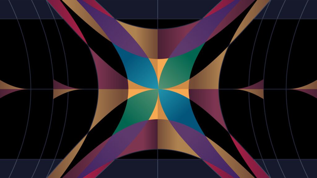
3. Radial Balance

You can check out the comprehensive guide I prepared for detailed information on Radial Balance: Radial Balance in Graphic Design: A Comprehensive Guide
Although the use of symmetric or asymmetric balance is common during the graphic design preparation process, artists also benefit from radial balance. Radial balance is the placement of an element at a central point. In this way, a visual expansion radiating from the center appears before us. While the artist initiates their message at the central point, the dissemination of the message is completed by the objects located around the element. The first point to attract attention will be the central part, the middle point. There is an order, a system, radiating outwards from the center. It is possible to benefit from symmetry again in the radiating area. However, it should not be forgotten that the focal point is the central part. Regardless of which balance principle is utilized, balance is essential in the composition. Whether it is a logo, a poster, or a sketchbook, it does not matter; aesthetic quality, attention-grabbing appeal, harmony, and memorability are achieved with the integrity of balance in graphic design.
4. Mosaic Balance

You can check out the comprehensive guide I prepared for detailed information on Mosaic Balance: Mosaic Balance in Graphic Design: A Comprehensive Guide
At first glance, mosaic balance may seem chaotic with no clear focal point. However, upon closer inspection, the objects within the chaos reveal an internal harmony.
Conclusion: The Importance of Balance in Graphic Design
Balance plays a very important role in visual design. A balanced design conveys the message you want to transmit effectively, in addition to visual aesthetics. Designers who want to leave lasting impressions on people must certainly reflect on design balance and the elements that will provide it, and conduct an effective analysis. Balance in graphic design is not just a visual element, but it is also important for the design’s functionality and usability.
You can also check out my article titled “Design Thinking: Putting the Solution at the Center“ for Design Thinking Methodology.