Before reading our comprehensive guide on asymmetrical balance in graphic design, you can review my article titled Balance in Graphic Design, where I explain the types of balance.
The human brain naturally loves order. However, order does not always mean “equality” or “mirroring.” Symmetry gives us confidence in architecture and classical art. But modern communication design demands more to attract attention. Asymmetrical balance in graphic design goes beyond a static arrangement. This technique takes the viewer on a visual journey. The designer ensures a dynamic unity by using elements of different weights. This is a hidden harmony within chaos. So, how do you professionally manage this invisible scale? Here is a comprehensive review with technical details.
What is Asymmetrical Balance in Graphic Design?
Let’s make a simple definition. Symmetrical balance is when two sides of a center line are equal to each other. In contrast, asymmetrical balance in graphic design is the arrangement of unequal visual weights. Here, the “visual weight” of the elements is essential, not their physical size.
Imagine objects placed at different distances from the center. On one side, there is a dominant visual. On the other side, there are text blocks, buttons, or negative spaces (white space). When these elements come together, the scale balances out. Consequently, the design does not tip over; on the contrary, it gains movement.
“Symmetry tells the viewer to stop; asymmetry whispers to move and explore.”
Visual Perception and Psychological Effect
Why do we prefer asymmetry? Because not everything in nature is symmetrical. The branches of a tree or the shape of clouds are asymmetrical. Therefore, asymmetrical designs feel more organic and natural to us. Additionally, asymmetry triggers the feeling of “curiosity.” The eye scans the structure that seems unbalanced. The brain tries to decode this structure. In this process, the viewer focuses on your message for a longer time. This method is critical, especially in web design projects, to increase the user’s dwell time on the page.
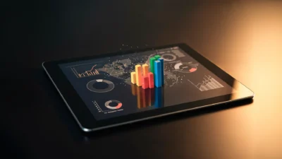
6 Basic Factors Creating Visual Weight
Achieving asymmetry is not a random process. It requires a purely mathematical and perceptual setup. As a designer, you must use the following 6 variables to distribute the “load” on your page:
1. Size and Scale
It is the most basic rule. Large objects are heavier than small objects. When establishing asymmetrical balance in graphic design, you can place a huge headline on the left of the page. To balance this weight, you need to add multiple smaller elements to the right side. Thus, the pans of the scale are equalized.
2. Color and Tone Value
Colors do not carry physical weight but they carry perceptual weight.
- Dark Colors: They are heavier than light colors. A black circle is more dominant than a gray circle of the same size.
- Warm Colors: Red and orange stand out more than blue. Using this information, you can balance a small but bright red button with a wide but pale background image.
3. Texture and Pattern
Complex textures tire the eye and hold it there. Flat and smooth areas allow the eye to slide. A textured area is visually very heavy. Therefore, if you used a textured visual, you must leave plenty of “negative space” on the other side. Otherwise, the design becomes suffocating.
4. Position and Isolation
Elements far from the center create a leverage effect. Think of it just like a seesaw. An object far from the center creates more weight than one close to the center. Also, an isolated element standing alone in space attracts more attention than a crowded group. “Loneliness” is a visual weight.
5. Shape and Form
Complex and irregular shapes are more interesting than simple geometric shapes (square, circle). Therefore, they are heavier. It is possible to balance a sharp-edged illustration with a simple text block.
6. Direction and Movement
Vertical forms are perceived as heavier than horizontal forms. Also, diagonal lines add great energy and weight to the design. You can direct the eye to the desired route using leading lines in asymmetrical balance.
Technical Implementation: Grid Systems and Rules
Asymmetry does not mean lawlessness. On the contrary, you need a strong grid system to ensure asymmetrical balance in graphic design.
Modular Grids
Designers usually use modular grids. They divide the page into columns. For example, while spreading the image over 4 columns, they place the text in 2 columns. This asymmetrical layout looks organized thanks to the invisible grid underneath. It is this invisible skeleton that prevents chaos.
Rule of Thirds
This rule, coming from photography, is perfect for asymmetry. Divide the screen into three equal parts horizontally and vertically. The intersection points are your focal points. Place the main object not in the center, but on one of these intersection points. Leave the other side empty or fill it with a lighter element. This is a guaranteed method of asymmetrical balance.
Advantages and Disadvantages of Asymmetrical Balance
Every design decision is a trade-off. You must know what you gain and what you risk when using this technique.
Advantages:
- Storytelling: You tell a story by directing the eye in a specific order.
- Modern Aesthetic: It makes the brand look innovative and dynamic.
- User Interaction: Unexpected placements break the “banner blindness” effect.
- Flexibility: It allows you to use different content types (long text, horizontal image) on the same page.
Disadvantages and Risks:
- Implementation Difficulty: It is hard for novice designers to strike the balance.
- Risk of Clutter: If structured incorrectly, the design looks “broken” or “unfinished.”
- Mobile Compatibility: An asymmetrical structure that looks great on desktop may lose its meaning on the mobile screen (vertical flow). Caution is required in responsive design.
Sectoral Usage Areas and Tips
Asymmetrical balance in graphic design works differently in every medium.
- Web Design (UI): Split screens are very popular. A large product photo on one side, a headline and “Buy” button on the other. This asymmetry emphasizes the Call to Action (CTA).
- Editorial Design (Magazine/Catalog): Instead of centering headlines at the top of pages, place them vertically at the bottom or side of the page. This keeps the reader’s interest alive.
- Logo Design: The “bite” in Apple’s logo is an asymmetrical detail. This small imbalance makes the logo memorable. A perfectly symmetrical apple would not be this iconic.
Conclusion
Balance is the gravity of design. Without it, everything falls apart. Symmetry teaches us order; however, asymmetrical balance in graphic design teaches us to dance. You must manage visual weights, colors, and spaces like a master. Be bold in your designs. Shift the main element from the center. Use space (negative space) as an active design element. Remember, perfect balance is not having the same thing on both scales; it is different things creating the same effect.