
Before reading our comprehensive guide on symmetrical balance in graphic design, you can review my article titled Balance in Graphic Design, where I explain the types of balance.
In a world dominated by chaos, the human mind involuntarily seeks a shelter. This shelter is order. The most rooted, powerful, and aesthetic tool providing this order in visual communication is the concept of symmetrical balance in graphic design. Behind a design looking “beautiful” or “professional” usually lies an invisible scale. This scale distributes the weight equally and gives the viewer the message that “everything is under control.” However, symmetry is not just a simple mathematical operation of centering elements. On the contrary, it is a deep discipline where psychology, geometry, and art intersect. In this comprehensive guide, we will examine the anatomy, usage strategies, and perceptual effects of symmetrical balance down to the finest detail.
What is Symmetrical Balance?
By its most basic definition, symmetrical balance is the arrangement of a composition with equal weight relative to a central axis (vertical, horizontal, or diagonal). Designers also call this “mirroring.” However, the key point here is the concept of “visual weight.” In the physical world, the equivalent of a kilo is clear. But in design, color, size, texture, and contrast determine the weight.
A dark-colored circle is perceived as “heavier” than a light-colored circle of the same size. Therefore, when establishing symmetrical balance in graphic design, you need to balance not just the shapes, but these perceptual weights as well. An imaginary line passing through the center divides the canvas into two equal parts. However, if these two parts complement each other, the eye does not get tired. The brain analyzes the image rapidly, and this cognitive fluency evokes a sense of “aesthetic pleasure.”
Historical and Biological Origins
Why do we love symmetry? The answer lies in our evolutionary codes. A healthy human face, animals, leaves, and flowers are symmetrical. In nature, symmetry is a sign of health and genetic quality. Therefore, when we look at symmetrical designs, we instinctively feel a sense of “trust” and “truth.” From Ancient Greek architecture to Renaissance paintings, art history is full of the pursuit of this perfect balance.
The Four Basic Types of Symmetry
Symmetry is not uniform. You use different types of symmetry depending on the design’s purpose, medium, and the message you want to convey. Each creates a different psychological effect on the viewer.
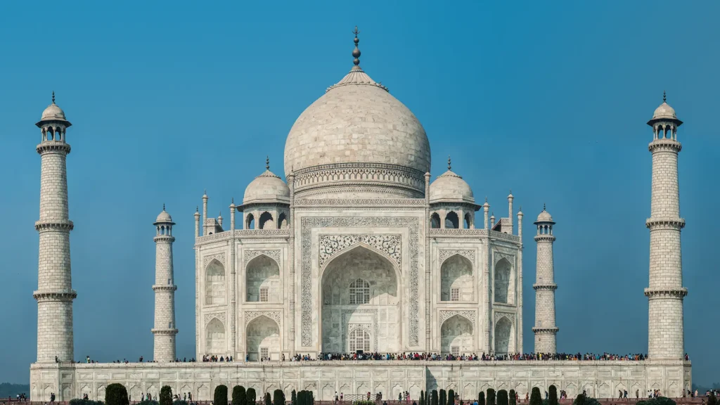
1. Reflection Symmetry
It is the purest and most frequently encountered type. The two sides of a vertical or horizontal axis are exactly the same (or very similar) to each other.
- Usage Areas: Formal invitations, book covers, luxury brand advertisements.
- Technical Detail: The general preference is towards the vertical axis (bilateral symmetry). Horizontal axis symmetry (like reflection in water) is effective in landscape photos or more abstract posters.
- Perception: It gives a sense of authority, seriousness, and permanence.
2. Radial Symmetry
Elements follow a circular flow from the center outwards. The design maintains its balance when rotated at any angle.
- Usage Areas: Logotypes (e.g., BP, Mercedes), icon sets, posters requiring a sense of motion.
- Technical Detail: The focal point is precisely in the center. Therefore, it is an ideal ground for “Call to Action” buttons or main headlines.
- Perception: It provides dynamism, infinity, and focus.
3. Translation Symmetry
There is no mirror image in this type. Instead, an element provides balance by repeating (shifting) at certain intervals.
- Usage Areas: Website background patterns, packaging designs, corporate identity textures.
- Technical Detail: It creates a sense of rhythm. At the same time, the space between repeating elements (negative space) is just as important as the element itself.
- Perception: It evokes a sense of movement, continuity, and rhythm.
4. Glide Symmetry
This is a combination of reflection and translation. An element is both reflected and shifted. Footprints are the most natural example of this; the right foot is the reflection of the left foot but is one step ahead.
- Usage Areas: Typographic compositions, modern posters.
- Perception: It is more modern and playful than classical symmetry.
Gestalt Psychology and the Law of Symmetry
As designers, we must definitely base our decisions on scientific foundations. Gestalt psychology, in particular, clearly explains how the human mind perceives visual stimuli. For example, according to Gestalt’s Law of Symmetry, the brain perceives designs prepared with symmetrical balance as an integrated group rather than independent parts. Thus, symmetry transforms even complex visual structures into a more organized and meaningful whole in our minds.
The brain wants to use energy efficiently. Processing complex and disordered visuals is difficult (Cognitive Load). However, symmetrical balance in graphic design makes the brain’s job easier. The brain, processing data quickly, releases dopamine. In other words, a good symmetrical design creates a biological pleasure in the viewer. For this reason, in user experience (UX) designs, form pages or login screens are usually made symmetrical; the goal is to ensure the user completes the transaction without confusing them.
“Symmetry is the rest stop of the mind.”
Sectoral Use and Strategies
Where and how you use symmetrical balance determines the brand’s tone of voice. Here are strategic examples from different disciplines:
Web Design and UI/UX
In the digital world, symmetry is the key to order. “Split Screen” designs have been popular in recent years. There is a visual on one half of the screen and text on the other. This creates a perfect symmetrical balance (scale).
Suggestion: To refresh trust on your homepage, you can align the headline and the “Buy” button exactly in the center. However, excessive symmetry can make the design static; you should utilize micro-animations to overcome this stagnation.
Corporate Identity and Logo
Look at the world’s biggest brands. Chanel, McDonald’s, Starbucks, Volkswagen. They all use symmetrical or nearly symmetrical logos. Logos prepared with symmetrical balance generally have much higher memorability; because these designs take place in the human mind faster. Moreover, they offer a balanced and stable appearance in every size, from mobile to giant billboards. Therefore, you should base your choice on the brand’s character. If your brand draws a ‘reliable, rooted, and serious’ image, you should prefer symmetry. Conversely, if you want to display a ‘creative, rebellious, and distinct’ stance, building your strategy on asymmetry will be much more effective.
The Symmetry Trap: How to Avoid Boredom?
The biggest enemy of symmetrical balance is monotony. A flawless mirror image can sometimes feel artificial and soulless. Professional designers use the “Broken Symmetry” or “Approximate Symmetry” technique to avoid falling into this trap. How is it done? Set up the general composition symmetrically. But create slight differences in the details.
- Color Difference: Let two sides have the same shape but change the color of one side.
- Texture Play: Let the text block on the left and the visual block on the right be the same size (symmetrical balance), but let their contents be different.
- Focus Point Shift: Like a single raised eyebrow on a symmetrical face; adding a small asymmetry without disrupting the general order keeps the interest alive.
Conclusion: The Mastery of Balance
Design is a problem-solving art. Symmetrical balance in graphic design is the most reliable formula we use while solving these problems. It gives peace to the viewer, clarifies the message, and adds authority to the brand. However, like every medicine, the dose is important. While excessive use can trivialize the design, its appropriate use can create a masterpiece. As a content architect, my suggestion is this: Learn the rules, apply symmetry perfectly. Then, break it with a slight touch to humanize that perfection. Real mastery lies in that little chaos within the balance. By using the power of symmetry in your designs, you can secure an unshakable place in the viewer’s mind.