Before reading our comprehensive guide on mosaic balance in graphic design, you can review my article titled Balance in Graphic Design, where I explain the types of balance.
Symmetry gives us confidence. Asymmetry arouses curiosity and incites action. However, mosaic balance in graphic design offers a completely different perceptual experience beyond these two. This technique, which does not allow the eye to rest on a single point and spreads over the entire surface, is an organized chaos. Thus, this method, also known as “crystallographic balance” among designers, hypnotizes the viewer when used correctly. In this guide, we will examine the psychology, application techniques, and why mosaic balance is indispensable for modern design in detail.
“Good design is like music; notes may be scattered but the melody is a whole.”
What is Mosaic Balance in Graphic Design?
Mosaic balance is an arrangement where visual weight is distributed equally across the entire composition. There is no hierarchy here. There is no lead actor. Instead, there are hundreds of extras taking the stage, and they all speak at the same time. However, this speech is not noise, it is in a choral arrangement. For example, when you look at a Jackson Pollock painting, you don’t know where to focus your eyes. Every drop of paint serves the whole. This is exactly what mosaic balance in graphic design is. Visual elements; color, texture, and form spread over the surface. Thus, the eye constantly wanders over the design. This adds high energy and dynamism to the design.
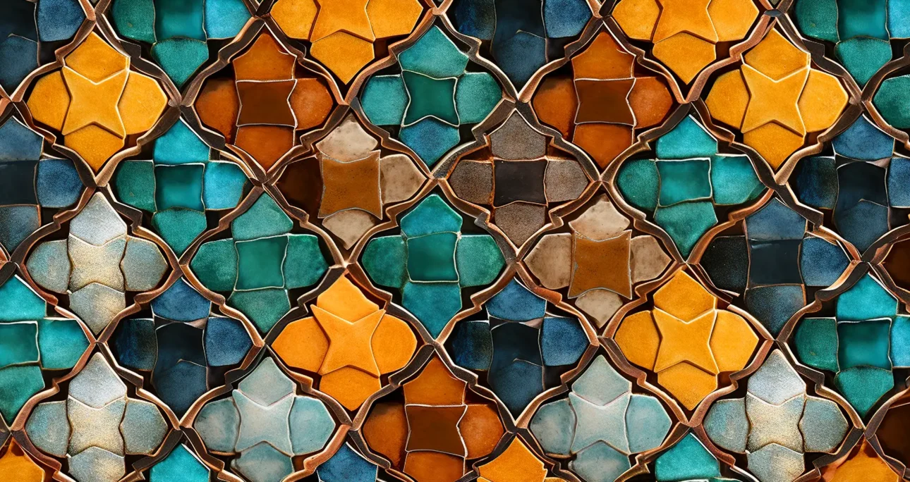
The Logic of Crystallographic Balance
This term comes from the repeating structures of crystals under a microscope. Although molecules seem random, they are within a flawless mathematical order. Ultimately, a similar logic operates in design:
- Absence of Focal Point: There is no area in the design that says “look here first.”
- Chaotic Order: It looks complex at first glance but does not disturb.
- Equal Weight: The top left corner and the bottom right corner are equal in terms of visual weight.

Gestalt Principles and Mosaic Perception
To understand mosaic balance, one must know how the human brain processes visuals. According to Gestalt psychology, the brain tends to perceive parts as a whole. Two principles, in particular, come into play in mosaic balance:
- Proximity: Objects standing close to each other are perceived as a group. In mosaic balance, elements are so close to each other that the brain sees the general “texture” rather than individual objects.
- Similarity: Elements that are similar in color or shape are considered related even if they are scattered. In this way, a rhythm is formed within the confusion.
How is Mosaic Balance Applied in Design?
You cannot achieve mosaic balance in graphic design by throwing random objects onto the canvas. This requires meticulous planning. Here are application strategies that are often overlooked but will make your design look professional:
1. Limit the Color Palette
Too many colors turn organized chaos into real eye fatigue. Use a harmonious and limited color palette. For example, a monochromatic (shades of a single color) approach balances the crowd of forms.
2. Forget or Manipulate the Grid
Traditional grid systems are too rigid for mosaic balance. Instead, adopt a “filled” approach. Place small, medium, and large elements so that equal negative space (white space) remains between them. The equality of the spaces creates the sense of order.
3. Use Rhythm and Repetition
While using objects of different sizes, repeat certain shapes. For example, let 60% of the design consist of circles and 40% of triangles. This repetition allows the eye to feel a sense of “familiarity” and relaxes the viewer.
Advantages and Disadvantages: When Should We Use It?
Like every design principle, mosaic balance has its strengths and weaknesses. You should choose this technique according to the purpose of your project.
Advantages: Why Should We Prefer It?
- High Energy: It instantly destroys stagnation. It creates an exciting and lively atmosphere.
- Background Power: It creates a great texture in websites or printed works. It prepares the ground to highlight the content.
- Sense of Discovery: The viewer enjoys getting lost in the details. This increases the time spent with the visual.
Disadvantages: What Are the Risks?
- Lack of Hierarchy: If you need to highlight a “Buy” button or a headline, mosaic balance is the wrong choice. The message is likely to get lost in the confusion.
- Visual Noise: If applied incorrectly, it tires and alienates the viewer. Care must be taken not to create “fear of emptiness” (horror vacui).
Sectoral Usage Examples
Mosaic balance is more common in the modern world than you think.
- Web Design (UI): “Masonry” grid structures like Pinterest are technically the digital version of mosaic balance. All contents are of different sizes, but they are all equally important.
- Packaging Design: Think of a granola package. [Shutterstock: Healthy granola packaging design showing ingredients in mosaic style] Images of oats, hazelnuts, and fruits are scattered messily on it. This gives the message “there is plenty of everything inside.”
- Editorial Design: This style frequently appears in editorial design. Magazine covers emphasize the diversity of content in this way.
Conclusion
Mosaic balance in graphic design is the playground of bold designers. This technique proves that non-symmetry can also have an order. The design does not create a static focal point; on the contrary, it draws a visual route for the viewer. If your project requires atmosphere and texture rather than hierarchy, mosaic balance is your strongest weapon. Remember, chaos turns into art when managed correctly. Don’t be afraid to try the techniques on this subject. Sometimes the best order lies within disorder.