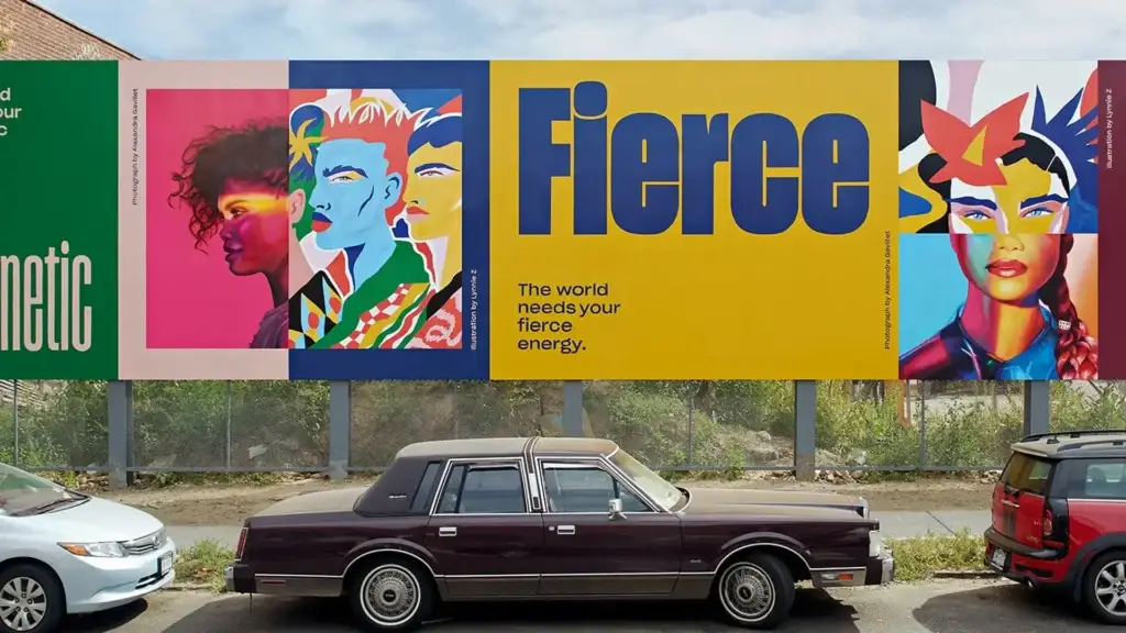
In design education, we were generally taught the rules of balance, symmetry, and harmony. These concepts ensure that a visual composition is “clean” and “safe.” However, in the modern communication age, these safe harbors sometimes turn into an “invisibility” trap. Because the human brain tends to notice and focus on any anomaly outside the ordinary. This is where visual tension, one of the most strategic weapons of professional designers, comes into play.
Visual tension is actually the art of consciously disrupting the static structure of the design. With this method, the designer evokes a sense of “incompleteness” in the viewer. The person feels as if the object is “about to fall” at any moment. The Zeigarnik Effect in cognitive psychology explains this feeling from its foundation. The brain focuses much more on forms that it cannot fully settle in the mind or that look physically unstable. In this article, we will examine this technique used as a strategic tool and brand applications in depth.
Theoretical Analysis: Why Should We Avoid Static Design?
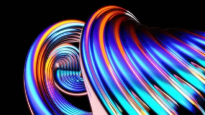
Art psychologist Rudolf Arnheim states that every visual model is pulled toward a center and has a physical weight. This situation is very similar to the entropy law in physics. Elements always seek the minimum energy level. However, a stagnant design is risky. It causes attention to slip away amidst digital noise. Visual tension allows us to manipulate this energy. We must use this method as a conscious strategy. For example, do not put an object in the middle of the frame. Try placing it in the furthest corner. This move makes the object look like it is “about to fall.” This potential movement fixes the eye on that point. Consequently, the designer transforms the static visual into a living experience. A perception process continues in the mind. Therefore, a professional art director uses tension. This technique is never a mistake. On the contrary, it is a powerful attention management tool. On the other hand, establishing this balance requires mastery.
Akbank and the “No Limit” Philosophy
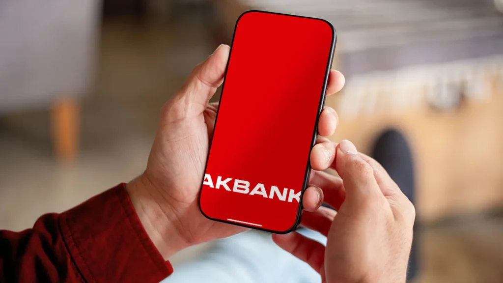
Akbank, one of Turkey’s most rooted banks, presented the boldest example of this technique on a local scale with its new design language in 2020. The banking sector has to instill confidence by its nature. Therefore, dignified and symmetrical compositions are usually preferred. However, Akbank broke this conservative approach and put the “Visual Tension” strategy at the center of its corporate identity.
In Akbank’s new visual world, the logo is not just a signature standing in a corner. On the contrary, the logo is consciously cut off at the upper limit of the frame. In the design world, this technique is called “Edge Friction.” This method evokes the feeling in the viewer that the logo creates an overflow beyond the screen. On the other hand, Gestalt’s “Completion” principle comes into play here. The human mind tries to automatically complete the cut letter. This effect is very strong, especially on the letter “A”.
In addition to this, this micro-second mental activity increases memorability. This design choice explains the bank’s promise of “being beyond limits” with a visual language without needing slogans. Ultimately, Akbank managed to differentiate itself from its competitors by using visual tension. Thus, it built a dynamic brand perception.
Dropbox and the “Creative Chaos” Strategy
Dropbox entered our lives as a file storage tool. However, the brand underwent a radical change in 2017. This process, managed by the Collins studio, led to major debates. The resulting new brand language was deliberately sabotaging the rules of harmony and hierarchy. Because Dropbox wanted to shed the identity of “just a cloud storage company” and emphasize itself as a “creativity platform.”
Dropbox carries specifically typographic blocks to the focal point in this transformation. Designers manage this process by adding very small notes next to huge letters that almost crush the screen. This extreme scale contrast, which feeds the concept of visual tension, creates tremendous dynamism in the hierarchy. Moreover, the brand deliberately disrupts the viewer’s visual comfort by preferring contrasting color palettes in the design. In this way, the design moves out of a static structure and turns into an active communication tool that forces the user to explore.
On the other hand, while capital letters almost “shout,” small notes “whisper.” Consequently, the user does not consume the design as a whole. Instead, they are forced to explore this tension-filled relationship between the parts. Thus, the brand embodies that “sweet restlessness” of the creative process. Ultimately, the chaotic nature of creativity has been transformed into a visual language with this method.
Nike and Dynamic Typography Tension
Nike is a sport and performance-oriented brand. Therefore, it benefits from tension to symbolize movement in its designs. Especially striking slogans like “Just Do It” are used. Typographic elements almost lean against the borders of the frame. In this way, the texts accumulate an energy ready to explode.
In Nike’s approach, texts are usually very close to each other. Sometimes the texts are used large enough to overflow outside the frame. This situation reflects the tension before an athletic performance. The distance of the texts to the edges creates a feeling of compression in the viewer. On the other hand, this compression births a visual “explosion point.”
Consequently, the eye is directed straight to the product image or slogans. However, wide negative spaces are left to balance this tension. The high-tension focal point combines with a spacious void. Ultimately, this combination reinforces the brand’s iconic perception of “speed and power.” Thus, Nike manages to tell a dynamic story through typography.
Technical Detail: The Mathematics of Breaking the Grid System
The Swiss Style has accepted the grid system (Grid) as the sacred rule of design for years. But for a professional designer, the grid is no longer a prison, but an elastic structure that needs to be stretched. The act of “grid breaking,” popularized especially by David Carson’s works in the 90s, maximizes the dynamism on the page.
However, breaking the grid does not mean placing elements randomly. On the contrary, every element that goes outside the grid must interact with the regular elements on the rest of the page. This situation creates a “gravitational field” in the composition. Texts overlapping or images being placed in the exact opposite of the reading direction (Z-Pattern) feed this tension. In this way, the user exits “autopilot” mode and enters a more active and conscious interaction with the interface. This situation provides a priceless advantage for brands, especially in today’s digital world where the attention span is very short.
Strategic Formula for Application
Using this method in every project can be risky in terms of user experience. For example, on a government office website or a hospital sign, the priority is always clarity. However, you can make a difference in advertising, branding, and artistic projects by following the steps below:
- Establish the System: First, solidify the foundation by creating a regular and mathematical grid system.
- Determine the Focus: Choose the main element (headline, logo, or product) that will be the heart of the design and carry the message.
- Sabotage the Balance: Move this main element outside the grid, overflow it from the frame, or create visual tension by enlarging and shrinking its scale disproportionately.
- Balance with Space: Use wide negative spaces in the rest of the page so that the tension is not suffocating and tiring.
Conclusion: Why Is Perfection Boring?
In the artificial intelligence age we are in, algorithms can produce “perfect” and balanced visuals in seconds. However, the real difference of the human touch and creativity lies in knowing where and how to disrupt that perfection. Akbank’s consciously cut letter, Dropbox’s seemingly incompatible contrasts, or Nike’s typography ready to explode are not design errors, but strategic moves.
If you do not want your brand or design to remain just a decoration, you must learn to “disturb” the viewer’s eye. Because a visual comfort zone is also a zone of being forgotten. Remember, the more the bow is stretched, the further and deeper the arrow of your message will reach.