The roots of graphic design rested in a static world where ink was fixed to paper for centuries. From Gutenberg to Bauhaus, typography was a still discipline built upon the rules of balance, hierarchy, and legibility. However, digital screens becoming the center of our lives woke letters from their centuries-long slumber. Text is no longer just a tool carrying information; it has transformed into a living entity that sets the atmosphere and moves. “Kinetic Typography” (Moving Type), as one of the most powerful narrative languages of modern graphic design, is redrawing the boundaries of visual communication. Personally, I do not view kinetic typography as a technical necessity.
In this article, I focus on brand identity and viewer psychology, examining the aesthetic and strategic effects.
Kinetic Typography and Audience Psychology
The human brain has been encoded in an extremely sensitive way towards motion throughout the evolutionary process. In nature, movement usually signals a danger or an opportunity. For designers, this primal impulse is a unique opportunity to manage the viewer’s attention. While the circulation of the eye in a static poster is at the viewer’s initiative, in kinetic typography, the designer sits in the director’s chair.
Kinetic typography does not just mean “moving texts”; it is the art of giving text “tone of voice” and “emotion.” The difference between a word floating slowly onto the screen and slamming down hard is equivalent to the difference between whispering and shouting. In this context, motion incorporates time, the fourth dimension of typography, into the design.
In a professional design setup, kinetic typography fulfills these three basic psychological functions:
- Emotional Intonation (Tone of Voice): In static typography, you can make the brand’s character felt through font selection (for example, a serious Serif or a friendly Sans-Serif). However, kinetic typography adds a behavior pattern to this character. Is your brand cheerful? Then you can make the letters bounce. Is your brand luxurious and calm? Then you can transform the letters into each other in a heavy and fluid manner.
- Storytelling and Flow (Narrative Flow): Motion puts information into a chronological order. It determines what the viewer sees, when they see it, and in what order of importance. This is critical for the digestion of the message, especially in commercials, title sequence designs, and social media content.
- Attention Economy: Amidst the intense visual pollution in the digital world, a moving headline is always perceptually ahead of its static competitors.
Kinetic Typography and Basic Principles: Physics and Aesthetics
“How” a text moves is just as important as “how much” it moves. Credibility in graphic design depends on the relationship motion establishes with the laws of physics (or the conscious violation of these laws). The 12 basic principles developed by Disney for animation constitute the constitution of kinetic typography today.
Timing and “Easing” Functions with Kinetic Typography
No object in nature suddenly reaches maximum speed and suddenly stops. Linear motion feels mechanical, artificial, and “soulless” to the human eye. Designers use “Easing” (Smoothing) techniques for living kinetic typography.
- Ease-In / Ease-Out: It is the acceleration of the text as it enters the scene and its deceleration as it approaches the point where it will stop. This gives the text a sense of weight and mass.
- Anticipation: The action of a letter stretching slightly in the opposite direction before going in a certain direction. Just like bending the knees before jumping, this movement prepares the viewer for the coming action.
These principles are not just software curves. They are aesthetic decisions that determine the feeling of the design.
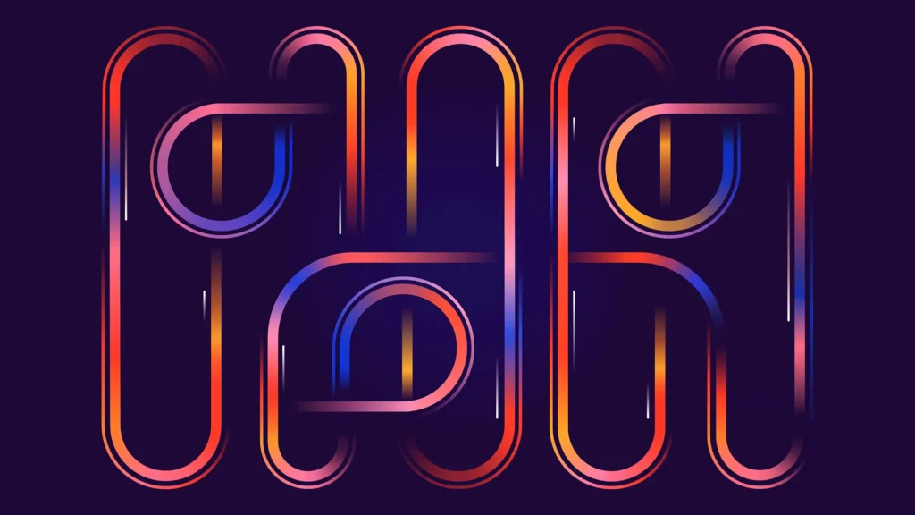
Variable Fonts: Infinite Flexibility in Design
In the past, designers were limited to using only specific weights of a font family (Bold, Italic, Regular). In the animation process, this caused sharp and clumsy transitions. However, Variable Font technology created a revolution in typographic design.
Variable fonts host an infinite number of variations within a single file. Properties such as thickness, width, slant, and even serif structure are defined as “axes.” With kinetic typography, this technology allows letters to change their form fluidly.
For example, when designing the word “Power,” you can expand the letters. You can pass from a thin form to a thick form as if breathing. This means that not only the position of the letters moves, but their anatomy as well. Designers now treat letters not as “pictures,” but as a form they can knead like dough. This flexibility has paved the way for brand identities (Dynamic Branding) to evolve from static logos to “reactive logos” that change shape according to the situation with kinetic typography.
The Balance Between Readability and Experimentation
Kinetic typography walks on the fine line between art and communication. The most frequent trap designers fall into is exaggerating the motion with aesthetic concerns and making the message unreadable. Here, the concepts of “Legibility” and “Readability” come into play.
In experimental typography, you can fragment or deform letters. Because here, our main goal is to convey emotion. However, the situation is different in information-focused designs. Motion should not get in front of the text and the content.
The Golden Rule: The longer and more complex the text, the simpler the motion should be. You can make headlines and slogans dance. But you must keep body texts static.
Accessibility and Inclusive Design
Design ethics require observing inclusivity as much as aesthetics. Avoid constantly shaking or flashing kinetic typography elements. These effects cause dizziness in sensitive individuals. You may lead to nausea. Furthermore, with this choice, you can pose serious risks for viewers with photosensitive epilepsy.
A good designer considers human physiology, not just aesthetic satisfaction, when adjusting the dosage of motion. Motion should not tire the viewer; on the contrary, it should guide the eye gently. The principle of “Less is more” remains valid in kinetic typography as well.
Conclusion: The Alphabet of the Future
Kinetic typography is not an art of decoration. It is a composition engineering that combines time and meaning. Moving texts appear before us in every medium. This proves that design has broken its static chains. Future designers will not only know technical settings. They will also learn to edit timing, speed, and momentum. Successful design does not make the motion noticed. It allows the viewer to feel the emotion carried by the motion. We no longer just read letters; we watch, feel, and live them.
If you liked this article, you might also enjoy the article The Secret to Structure in Graphic Design: Typographic Hierarchy, where I explain the basics of typography.