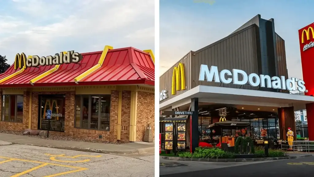
Visualize those iconic McDonald’s branches from the late 90s. With their red tiled roofs, giant golden arches, and plastic ball pits, they presented the liveliest example of maximalism. Those structures were almost like amusement parks. But today, the situation is completely different. The wind of minimalism has covered those cheerful buildings with anthracite gray composite panels. Thus, they all turned into a chic but distant ‘coffee shop’ simulation.
This wind of change was not limited to architecture alone. It also took over the visual identities of tech giants and luxury fashion houses. Look carefully at the logos of Google, Airbnb, Yves Saint Laurent, or Balmain. These brands put aside their unique, detailed, and serif logos between 2010 and 2020. Instead, they all switched to black, sans-serif, and risk-free fonts. As a matter of fact, they have all now returned to a ‘safe’ appearance that looks like copies of one another.
Both designers and end-users have been asking the same question inwardly for a while: “Everything used to be so colorful, why is the world clad in black, gray, and white now?”
The design discipline has long been under the dominance of “Minimalism” and “Clean Design.” However, the pendulum is swinging back, as it always has throughout history. Bored with white spaces, sterile interfaces, and “perfection,” the human brain craves chaos, texture, error, and color again.
Here it is before you, as a rebellion against silence and sameness: Maximalism, Anti-Design, and Neo-Brutalism.
1. The Era of “Blanding”: The Great Uniformity
Modernism’s legendary motto “Form follows function” was unfortunately misinterpreted in the digital age. Especially in the last 15 years, UX (User Experience) standards and mobile-first design understanding have forced all interfaces into a single mold. Industry leaders call this “The Great Blanding.”
Bloomberg writer Ben Schott defines this situation as “Startup Minimalism” in his viral article. According to Schott, because brands are afraid of making mistakes in the global market, they gave up their characters and adopted a faint visual language that “appeals to everyone but connects with no one.”
The reasons for this aesthetic sterility and uniformity are much deeper than we think. Primarily, brands fearing mistakes in the global market avoid taking risks. They do not want to deal with the ambiguity of colors and details. Therefore, they take refuge in the ‘safe’ harbor of black and white.
Moreover, this preference combined with a technological legacy. In the past, ‘flat’ design was mandatory for readability on low-resolution screens. Whereas today, retina screens are flawless. Yet, we stubbornly maintain this old habit.
However, the real culprit is probably the obsession with optimization. Data-driven processes push emotion out of the equation. Because the cold logic of A/B tests always rewards the ‘simple.’ Consequently, we increased click-through rates and improved metrics. But unfortunately, in this process, we destroyed the unique soul of brands.
University of Potsdam Interaction Design Professor Boris Müller clearly diagnoses this crisis in his article titled “Why Do All Websites Look the Same?“ which made a big splash in the industry: We are no longer designing, we are just filling templates. Creativity has been replaced by ‘best practices’ lists and safe approaches.
However, there is a problem: When everyone is “clean,” no one is “memorable.” Neuro-aesthetic research shows that our brains are hungry for contrasts, complexity, and details. A completely flat white wall dulls the mind after a while.
“Less is not more. Less is a bore.” — Robert Venturi
2. What is Maximalism? The Aesthetics of “More”
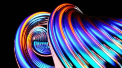
Maximalism is the antithesis of minimalism. Its fundamental philosophy is based on the principle of “More is More.” This movement acts with the fear of empty space (Horror Vacui). It does not hesitate to fill the canvas, screen, or paper. However, this is not piling items randomly; it is the art of creating a controlled chaos.
Maximalism offers the viewer a story to discover. While Minimalism says “look here, do your job, and leave,” Maximalism says “stay here, examine, get lost, and feel.”
The Three Pillars of Maximalism in Design:
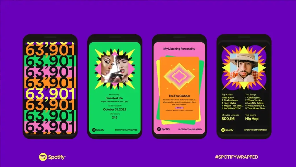
- Bold and Clashing Colors: Instead of harmonious pastel tones; neons, acid greens, electric blues, and clashing color palettes. The psychedelic color usage and exuberance in data visualization that Spotify increases the dose of every year in its “Wrapped” campaigns is the best example of this.
- Texture and Layering: In defiance of digital smoothness; paper textures, noise effects, glitches. Typography on photography, illustration on top of that, stickers on top of that… This is how you create a perception of depth.
- Pattern Repetition: Repetitions that hypothesize, rather than tire, the eye. In the fashion world, Gucci’s rise during the era of former creative director Alessandro Michele is proof of exactly how this maximalist aesthetic shattered luxury simplicity. By combining mismatched patterns, Gucci took luxury out of being “sterile” and made it “fun.”
3. Anti-Design and Brutalism: Learning to Break the Rules
While Maximalism is an aesthetic choice, Anti-Design is a political stance. It consciously violates traditional design rules (alignment, readability, grid systems).
The roots of this movement go back to the 90s Grunge aesthetics and the legendary designer David Carson. With his work in Ray Gun magazine, Carson transformed design from a text that needs to be read into an “experience that needs to be felt.” He was even bold enough to print a boring interview with Bryan Ferry entirely in symbols (using the Dingbats font) to make it difficult to read. His philosophy remains valid today:
Don’t mistake legibility for communication. Just because something is legible doesn’t mean it communicates. — David Carson
Neo-Brutalism in the Digital World
Today, the “Neo-Brutalism” movement we see in web design, especially in the Figma, Gumroad, and Notion ecosystem, feeds on these roots.
- Raw HTML look.
- Standard, shadowless blue links.
- Black, thick stroke buttons.
- Surrealist and raw visuals.
This style is the brand’s way of telling the user: “I am not corporate, cold, and perfect. I am sincere, functional, and here.” When you examine the website of the digital creator economy platform Gumroad, you see this manifesto clearly. Bright pink backgrounds, giant black contours (stroke), visuals resembling 90s clip art, and typography clashing with one another… This is not a mistake or amateurism; it is a conscious, bold, and very successful rebellion against the sterile technology world.
4. Gen Z and the Y2K Effect: The Wind of Nostalgia
There is not only an aesthetic but also a sociological reason behind the longing for “Everything used to be colorful.” Generation Z (Gen Z) has been surrounded by “perfect” digital interfaces since the day they were born. For them, the smooth glass of the iPhone and the flawless interface of iOS are a standard, not an innovation.
That is why they yearn for that optimistic, colorful, pixelated, and “imperfect” internet world of the early 2000s (Web 1.0). We call this Y2K Aesthetics.
It is no coincidence that TikTok and BeReal’s “raw and messy as it is” content rose as a reaction to Instagram’s flawless, filtered world. Design embraces this sincerity as well. Shiny metallic buttons, pixelated icons, “ugly” fonts similar to Comic Sans, and complex collages have become the new way for brands to connect with the young audience.
Burger King abandoned the minimalist blue circle used for 20 years. Instead, it returned to the plump and colorful style of the 70s. In fact, this change is a great victory for maximalism. Thus, the brand completely got rid of the sterile look. Ultimately, they chose to be delicious and fun again.
5. Strategy for Designers: How Do We Manage Chaos?
As an Art Director or designer, you shouldn’t drown all projects in uncontrolled chaos tomorrow after reading this article. Maximalism and Anti-Design are powerful when used in the correct context.
- Maintain Hierarchy: Even if there is visual chaos, the “Call to Action” must be clear. Establish order within the chaos through color contrasts. You manage where the eye looks.
- Dosage According to Sector: Brutalism is risky for a law firm or medical application (it may create trust issues). However, it is a great differentiation tool for a fashion brand, music festival, creative agency, or personal portfolio.
- Boldness in Typography: If the visuals are complex, keep the typography huge and clear. Or vice versa; on a clean background, use a kinetic typography that breaks rules, stretches, and bends.
In conclusion; in a graying world, the conscious use of color is now a strategic method of differentiation. ‘Simple’ is safe, but ‘bold’ is memorable. As designers, our role is not to confine every project to sterile simplicity, but to reintroduce the necessary vibrance, character, and soul into the design, as the context demands.
Remember, a perfect design is invisible to the eye, but a brave design touches the heart.
In this article, we talked about the aesthetics of chaos; so, have the rules of simplicity been completely erased? To gain a balanced perspective, you can examine Minimalism in Design: Inspiration from Simplicity.