Grafik tasarımda denge, oldukça fazla detaya sahip olan grafik tasarım için kritik bir detaydır. Bu detayların hepsi de tasarımdaki mükemmelliği meydana getirmektedir. Mühim olan kusursuzluk değil, tasarımdaki uyumdur. Yani grafik tasarımda denge oluşumudur. Tasarımlarda denge istenen mesajı verecektir. Sanatçının aklından geçen yaratıcılığın izleyici ile buluşmasını sağlayacaktır. Tüm grafik tasarımcıları, elbette tasarım dalındaki sanatçıların da dengeyi iyi işlemesi önemlidir. Doğadaki her şeyin bir dengesi bulunmaktadır. Doğal olarak görsel tasarımda da karşımıza denge çıkmaktadır.
Grafik Tasarımda Denge Nedir?
Grafik tasarım, bildiğimiz gibi, görsel araçlar aracılığı ile bir mesajı belirli bir kitleye ve topluma iletmemizdir. Akıldaki bir mesajı, yaratıcılığı veya bir metni fark etmeksizin görselleştiririz. Burada tasarımcının kompozisyonu çeşitli detaylarla oluşmaktadır. Detayların en önemlisi belki de bütününü oluşturan ise elbette dengedir.
Grafik tasarımda denge, bir kompozisyonda tasarımcının vermek istediği mesajı bir uyum içerisinde sunmasıdır. Grafik tasarım hazırlama sürecinde tasarımcının dengeyi oluşturması her sanatçı için farklı işleyebilmektedir. Dengenin türleri sanatçının vereceği mesaj bakımından da farklılık gösterebilir. Ne var ki, önemli olan her zaman tasarımda bütünlüğü ayarlayabilmektir. Böylelikle kompozisyondaki estetik duruş, görsel açıdan çekicilik, yaratımdaki zekâ göz önünde yer alabilecektir.
Görsel tasarım yaparken denge ve uyum için kullanabileceğiniz unsurların bir kısmı şöyledir.
- Beyaz alan / Boşluk
- Nesne ve Görseller
- Metin ve Başlıklar
- Renkler ve Dokular (Saydamlık, doygunluk, ton vb.)
Grafik Tasarımda Denge Türleri
Grafik tasarımda denge kullanımı sanatçıların mesajlarını her daim estetik olarak sunmasını sağlamaktadır. Bunda sanatçının amacı ne olabilir? Elbette daha akılda kalıcı olmak, dikkat çekmek, iletilmek istenilen mesajın yıllarca hatırlanabilir olmasını sağlamaktır. Grafik tasarımda öncü olabilmelidir, yeni fikirlerin oluşumunda yol açabilmelidir. Bu da tasarımdaki denge bütünlüğü ile meydana gelebilmektedir. Denge grafik tasarımın en temel ilkelerindendir. Ancak temel bir simetriye bağlı değildir. Dengeli bir görsel hazırlamak için kullanılabilecek birden fazla yol vardır.
1. Simetrik Denge
Simetrik Denge hakkında detaylı bilgi için hazırladığım kapsamlı rehbere göz atabilirsiniz: Grafik Tasarımda Simetrik Denge: Kapsamlı Rehber
Simetrik denge dediğimizde, aklımıza bir görseldeki kompozisyonun kusursuz bir çizgi üzerinde karşımıza çıkması gelmelidir. Yani, göze hoş gelen bir estetik, tekrar eden detaylar, desenler bulunmalıdır. Belirli nokta veya desenlerin, bir nesnenin aynı düzlem üzerinde yer almasıdır. Görselde bir yüz yer alıyorsa düzgün bir kompozisyona sahip olmalıdır. Kaşlar, gözler, burnun iki deliği veya kulaklar simetrik olmalı, dengede durmalıdır. Bir logo hazırlarken veya iki taraflı bir kompozisyon hazırlarken tüm detayların yine bir çizgi üzerinde, eşit noktalarda yer almasına dikkat edilmelidir. Peki, hazırladığımız her tasarım simetrik denge üzerine mi kurulmalıdır? Elbette hayır. Başta da söylediğimiz gibi her tasarımcının iletmek istediği mesaj farklıdır. Hazırladığı kompozisyon, esinlendiği detaylar farklıdır. Bunlara göre bir denge hazırlayabilir. Önemli olan grafik tasarımda denge bütünlüğünün bozulmamasıdır.
2. Asimetrik Denge

Asimetrik Denge hakkında detaylı bilgi için hazırladığım kapsamlı rehbere göz atabilirsiniz: Grafik Tasarımda Asimetrik Denge: Kapsamlı Rehber
Grafik tasarımda denge konusunu işlerken asimetrik detaylardan da faydalanırız. Asimetrik denge, sıklıkla sanatçıların doğal yollara başvurmasıdır. Belirli bir düzlemden çok farklı noktalardan, köşe veya eksenlerden faydalanırız. Kompozisyonda bir hareket yakalamak istediğimizde asimetrik denge ile karşılaşırız. Her nesne aynı boyutta olmak zorunda değildir. Aynı renk, aynı ton kullanma zorunluluğu yoktur. Fakat dikkat etmemiz gereken nokta, bu asimetriliğin, farklılığın bir denge yaratmasıdır. Bu şekilde ilgi çekici sonuçlar elde edebilir, odak noktasını belirleyebiliriz. Estetik yapıyı bu şekilde sağlarız.
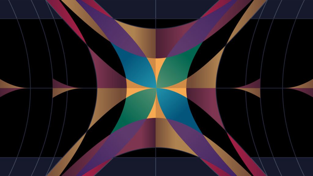
3. Radyal Denge
Radyal Denge hakkında detaylı bilgi için hazırladığım kapsamlı rehbere göz atabilirsiniz: Grafik Tasarımda Radyal Denge: Kapsamlı Rehber
Her ne kadar grafik tasarım hazırlama sürecinde simetrik veya asimetrik denge kullanımı yaygın olsa da, sanatçılar radyal dengeden de yararlanmaktadır. Radyal denge, merkezî noktada bir ögenin yer almasıdır. Bu şekilde merkezden etrafa yayılan bir görsel açılım karşımıza çıkmaktadır. Sanatçı merkezî noktada mesajını başlatırken, mesajın yayılımı da ögenin etrafında yer alan nesnelerle tamamlanmaktadır. İlk dikkat çekici nokta önce merkezî kısım, orta nokta olacaktır. Merkezden dışa doğru yayılan bir düzen, sistem bulunmaktadır. Yayılan bölgede simetriden yine faydalanmak mümkündür. Ancak odak noktasının merkezî kısım olduğu unutulmamalıdır. Hangi denge ilkesinden yararlanılırsa yararlanılsın, kompozisyonda denge şarttır. İster logo olsun, ister bir afiş, bir çizim defteri fark etmez; estetiklik, dikkat çekicilik, uyum, akılda kalıcılık grafik tasarımda denge bütünlüğü ile sağlanmaktadır.
4. Mozaik Denge

Mozaik Denge hakkında detaylı bilgi için hazırladığım kapsamlı rehbere göz atabilirsiniz: Grafik Tasarımda Mozaik Denge: Kapsamlı Rehber
İlk bakışta bir kaosun hâkim olduğu ve belirli bir odak noktası bulunmayan mozaik dengeli görsellere daha yakından baktığınızda tüm bu kaosu oluşturan objelerin kendi aralarında bir uyum içerisinde olduğunu görebilirsiniz.
Sonuç: Grafik Tasarımda Denge’nin Önemi
Dengenin, görsel tasarımda çok önemli bir rol oynamaktadır. Dengeli bir tasarım, görsel estetiğin yanı sıra iletmek istediğiniz mesajı da etkili bir şekilde aktarır. İnsanlarda kalıcı izler bırakmak isteyen tasarımcıların muhakkak tasarım dengesi ve bunu sağlayacak olan unsurlar üzerine düşünmesi ve etkili bir analiz yapması gerekir. Grafik Tasarımda Denge sadece görsel bir öğe değil, aynı zamanda tasarımın işlevselliği ve kullanılabilirliği için de önemlidir.
Design Thinking Metodolojisi için Tasarım Odaklı Düşünme ile Çözümü Merkeze Almak başlıklı yazımı inceleyebilirsiniz.